Meeting Magda
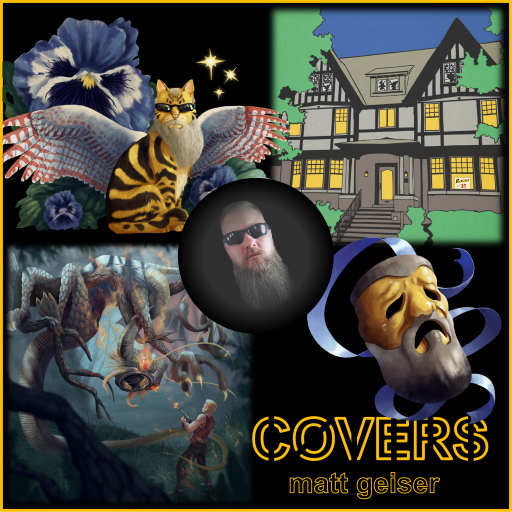
Album Art as Armor

I didn’t think my music was good enough to get noticed on its own. So I decided the artwork had to grab people’s attention and make them want to listen.
This wasn’t rational thinking. It was my insecurity dressed up as strategy. I’d been making music part time for less than two years. I was learning as I went, recording covers and a few original songs in GarageBand, teaching myself mixing and mastering. The music wasn’t terrible, but it wasn’t great either.
I’d spent my whole life chasing positive affirmation. “Aren’t you cute, handsome, good.” Whatever validation was available, I wanted it. Music was supposed to be different. It was supposed to be about the work, not the approval. But when you’re about to release your first album and you’re not sure anyone will care, old, deeply engrained habits emerge.
I needed three pieces for the Covers album: a Cool Cat with angel wings (inspired by Edie Brickell and Nirvana), a crying theater mask (inspired by Roy Orbison), and a graphic image of a broken-down mental hospital based on our house (inspired by David Bowie). I had concepts but no ability to execute them. I’m not a visual artist. I needed help.
I asked my daughter Celeste if her friend, “Skittle”, who drew D&D characters might be interested. That’s how I met Magda.
Magda was a graphic design student. She’d just finished a D&D character commission for Celeste. When I pitched the three-piece project with an end-of-month deadline, she politely pushed back. She couldn’t do all three that quickly. But she could do the cat. Maybe the mask too, if I could extend the deadline.
We agreed on the cat and the mask. She’d start with the cat.
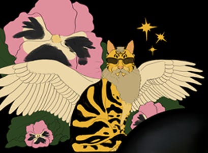
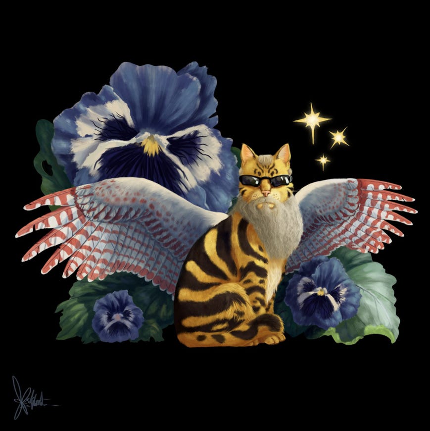
The Cool Cat concept was a mashup of my face and a sitting cat with angel wings, flower, and stars. I wanted Pittsburgh Steelers black and yellow. The wings needed to be fully spread, at least as wide as the cat’s height. I hadn’t thought much about the tail, flower, or stars, so I told Magda to sketch something and we’d iterate.
She sent the first concepts. A yellow tabby with black stripes, pansies inspired by Alice in Wonderland, and kestrel-patterned wings. She’d made the pansies pink and black to match the Pittsburgh theme, but then offered an alternative with different colors so they wouldn’t compete with the cat. The stars had a few variations, one similar to the album cover reference, others with different shapes and positions.
I loved it. But I didn't want pink flowers. Could she work in blue and red from the Steelers logo? Could she add red accents to the wings?
She adjusted. Blue and red accents. Kestrel patterns on the wings. The background stayed black, and she’d send both a signed version and an unsigned version for the album cover.
“I absolutely love your artwork,” I wrote.
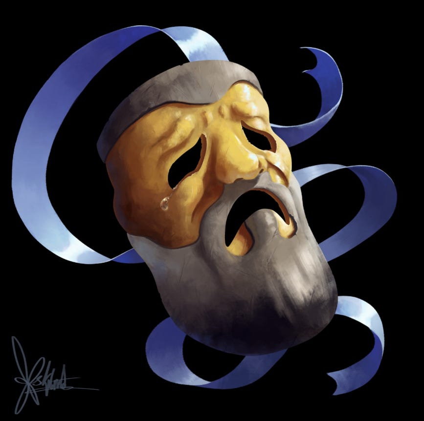
The crying mask came next. I wanted a theater mask with my facial features worked in, a salt-and-pepper beard and hair mixing yellow, black, grey, and white to give it a Jabberwock-like feel. Could she add a teardrop on the right side, similar to Roy Orbison’s crying mask?
She sent an initial concept. I asked for adjustments. More contrast between the mask and the beard. Multi-colored hair to create a “salt-and-pepper” effect, maybe using the colors to give the mustache and hair a Jabberwock-like feel, similar to the whiskers and antennae.
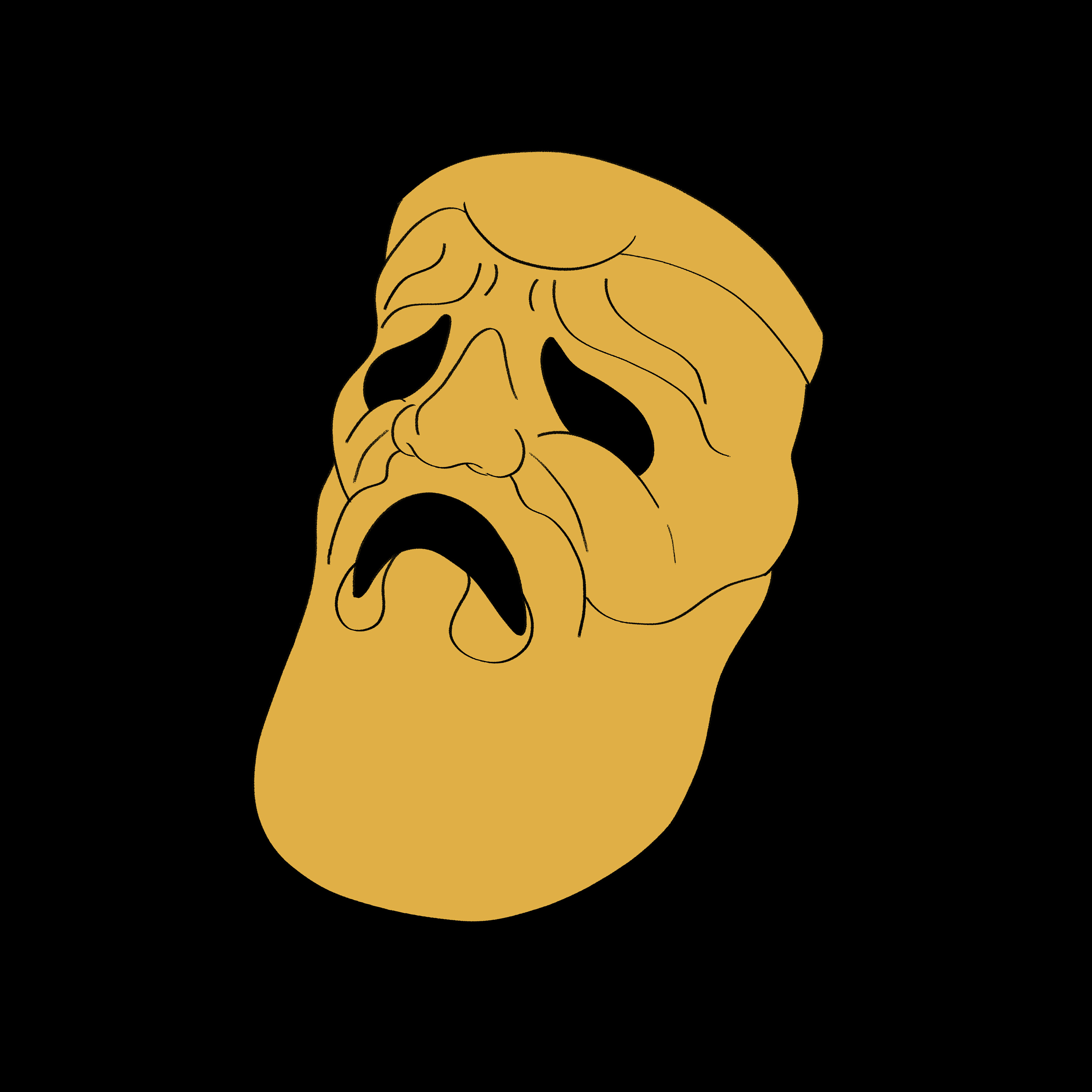
She refined it. The mask had depth, texture, emotion. It wasn’t just a mashup. It was art.
“This is wonderful,” I wrote. “I really enjoy working with you.”
When I saw how good the cat and mask were, I realized Magda could handle something more ambitious. I pitched a third commission.
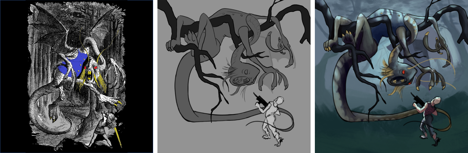
“I have another idea for my album art,” I wrote. “The album is mostly covers except for one original song called ‘Mac the Gun / Jabberwock.’ My concept for the album art is similar to the original artist rendition of Lewis Carroll’s Jabberwock, except incorporating some of the concepts from the cat and mask. The other idea is to have the boy wielding a machine gun (instead of the sword) shooting at the Jabberwock. What do you think? Is this a project you’re willing to take on?”
She was interested but needed clarity. This would be more complex than the cat or mask. Two interacting characters, possibly full-body depending on the composition. She’d need at least a month to complete it.
We set a deadline. She’d start after finishing the cat and mask.
The Jabberwock iteration began in late November. She sent rough sketches. I loved the twisting, unnatural pose of the creature, the way branches could emphasize its monstrous nature. For Mac, I suggested a gangster-style “shoot from the hip” posture with a Thompson machine gun. Maybe a modern-day chainmail look for his shirt. No sleeves. Decent muscle tone. A few nasty scars.
I sent her a photo from 1988, my sister’s high school graduation. I was 17. “Even though you won’t be able to see Mac’s face,” I wrote, “I think he might be a young version, and Jabberwock be the old, growly, bearded version.”
She sketched. I responded. She adjusted Mac’s pose, making him stand more realistically for the gun. “I hope it’s going in the right direction,” she wrote. “I have never held a gun before in my life.”
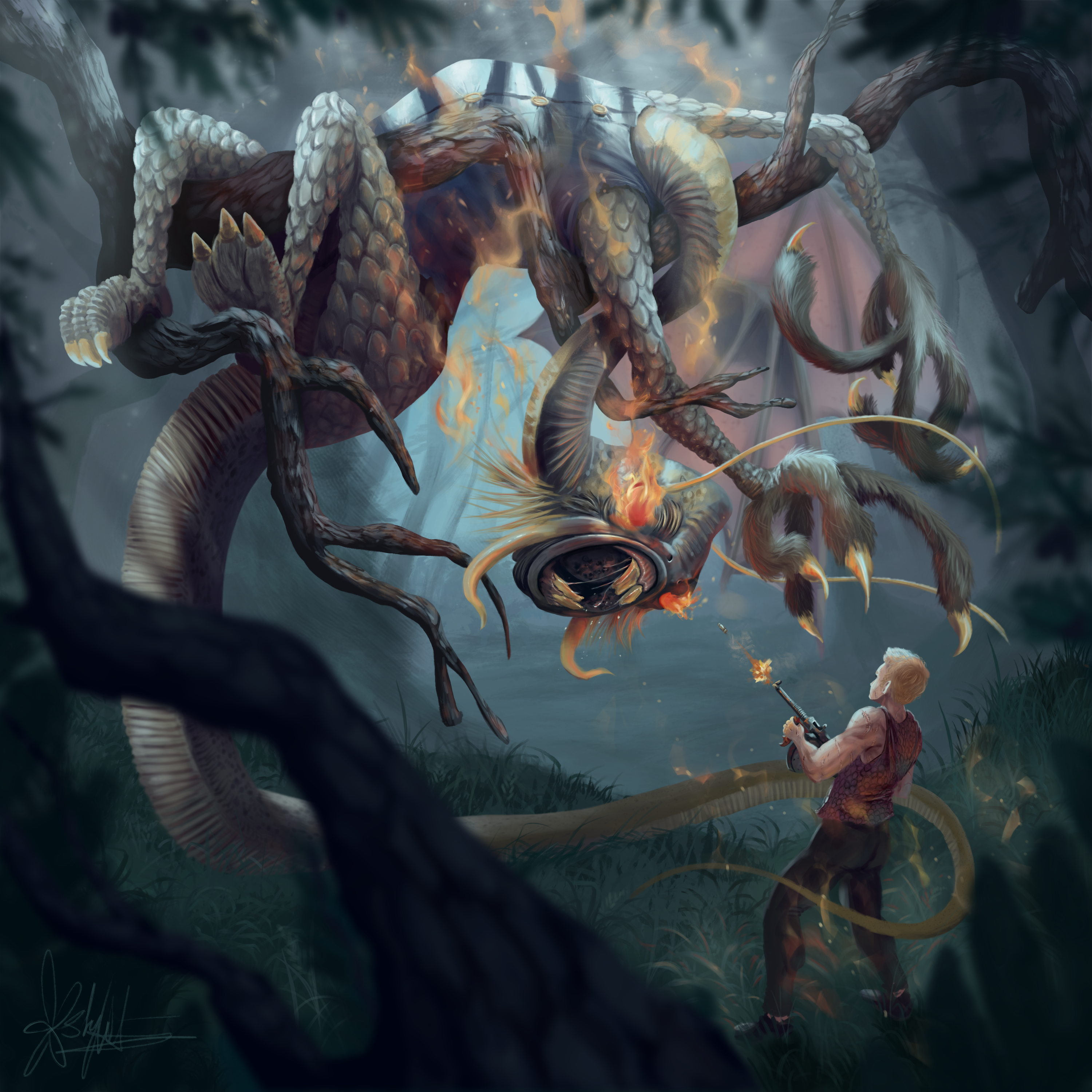
“OMG!!!” I wrote. “This is amazing! I really like how you did the flaming eyes. And the claws and tail. And the scales. And Mac’s gun. Holy crap this is AWESOME!”
She added fire accents around Mac, adjusted the tail to fit the original Lewis Carroll reference, and refined the details. In December she sent the final version.
“These are fantastic!” I wrote. “Thank you so much for your incredible artwork. I am so grateful that you were able to do these commissions. You are a very talented artist and I hope you are willing to work with me on future projects.”
She was. And she did. Over the next three years, Magda created artwork for Vinyl Scars and multiple singles from Lessons From The Long Game. The Cool Cat, Crying Mask, and Jabberwock set the visual tone for everything that followed.
But here’s what I learned: the artwork didn’t make my music better or fix my insecurity. It gave me confidence to release Covers, yes. It made the album feel more real, more intentional. But eventually, I had to accept that if my music wasn’t good enough to listen to on its own, artwork was just lipstick on a pig.
The collaboration with Magda mattered because she understood what I was trying to do. She listened to my music. We iterated together. She wasn’t just executing my concepts. She was contributing her own ideas, refining mine, making the work better than I could have imagined.
That’s what I needed. Not armor.